Launched in 2012 Skypod Residences Puchong is a 640 units service apartment located along Puchong Golden Mile. Fast forward to February 2016, the 2 towers of Skypod Residences Puchong had both now VPed. Skypod Residences Puchong Tower B VPed approximately 1/2 year ago.
To those who frequent Puchong Golden Mile (herein defined as the mega 12 lanes carriage way from IOI Mall to Bandar Puteri Puchong or ‘the straights of Puchong’), you will unlikely miss Skypod Residences Puchong.
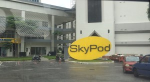
Skypod Residences Puchong’s 2 Towers stood majestically opposite IOI Mall, unfazed and hugely recognizable despite being tucked behind IOI Business Park.
Unlike the Setiawalk or Bandar Puteri Puchong stretch, there are no many highrise around Bandar Puchong Jaya, IOI Mall stretch Skypod is be poised to be the land mark of Bandar Puchong Jaya, and we will tell you why.
Do pay attention to the facade of Skypod Residence Puchong, it is not easy to not remember!
It is definitely one of the memorable one! 忘-望不了 Get the point? This iconic building will definitely here to stay!
Pros:
- Location, location, location
-
All amenities just 1-2km away, Setiawalk, cinemas, kareoke, banks, coffee, mamak, cafe, public transport, walking distance to IOI Mall & LRT station.
-
Average units are priced very competitve at sub 500psf to 600psf, and developer managed to deliver few months ahead of contractual VP.
Cons:
- Facade choice of color can be better.
- Access is via Persiaran Puchong Jaya Selatan only.
- Significant cost cutting measures are seen. ‘Cut Spec’. We can point out a few again the brochure artist illustration.
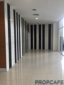
a) lift lobby area are under-delivered, we thought we saw double volume lobby, grand lobby is not grand at all
b) club house is short that it is supposed to be in brochure.
c) green areas in brochure, i.e attached to facilities, attached to facade, wall areas are intentionally left blanks
d) Skypod Residences Puchong brochure branded the Skypod Residences as New Age Luxury, it is otherwise, mid cost apartment at best.
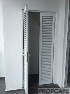
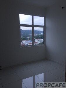
e) windows size shrank, sliding door size shrank
Don’t take our words for it, like usual we will have the picture to do the talking, enjoy!


Facade looks like a flat.
Pros is only location .
Window Looks small and ugly.
IOI can only be a mid cost developer. Better don’t buy their high end condo
Dear KS many thanks for your comment.
Agree with your observations.
The product in some extend reflects image of the company is.
This is a classic text book case of brochure vs reality
It’s always inherent risk to buy high end project and overtime we observed alot of developer tend to over promise and under deliver.
I can only imagine what Skyz would look like when its VP’ed.
Dear BolaBesar
Lol, your guess would be as good as mine.
walk-able to LRT?
Dear vinspong
Affirmative.
Wow IOI reputation is at stake. Thought it should be high end product.
Dear Keronzi9
Beauty it is in the eye of beholder.
OMG ! such a poor quality project, can’t imagine this building cheap look will be after few more years, is totally overpriced and under delivered. Pity the buyers….subsales will be very very difficult to let go, also can’t expect to have good rental return.
Dear Terry
Thanks for your comment. Cheap or not, we let the public and stakeholders to decide. While for investor and owners we are sure, buying a property could be a lifetime commitment. Perception is a scary thing. To have an iconic structure in Jalan Puchong to represent a image of company is a double edge sword.
awww, will le pavillion also become like that? >_<
[…] PropcafeTM has covered few property reviews in the past. You may click The Pavilion and Skypod. […]