EKOCHERAS DUPLEX STUDIO 762SQ – Industrial Theme With Earthy Approach
Recently friend of our channel has completed his renovated unit at EkoCheras and kind enough to invite us for visit. His approach to ID design is out of the usual mould and we really like how his vision to bring practicality and good taste ID to life. He is kind enough to share with us his experience on his own words here. Enjoy!
THE APPROACH
Having just gotten the key to my very first studio apartment with double volume (DV) feature in living area, naturally just like everyone else, I had butterfly in my stomach and soon I broke the internet in search for the unique ID to compliment the unit.
From newest lighting effect with expansive pendent or chandelier to long hanging fan off the 18’ high ceiling, or perhaps extension of the mezzanine floor to include a small bedroom or study area.
However to my dismay, the management of the building soon to ban any form of mezzanine floor extension due to the loading factor and after seeing few units that undertook fully furnished renovation via walk in or in social media, I hit a roadblock.
My observation is that although some of these units are nice enough, but they didn’t give me the ‘wow’ factor that I was yelling for.
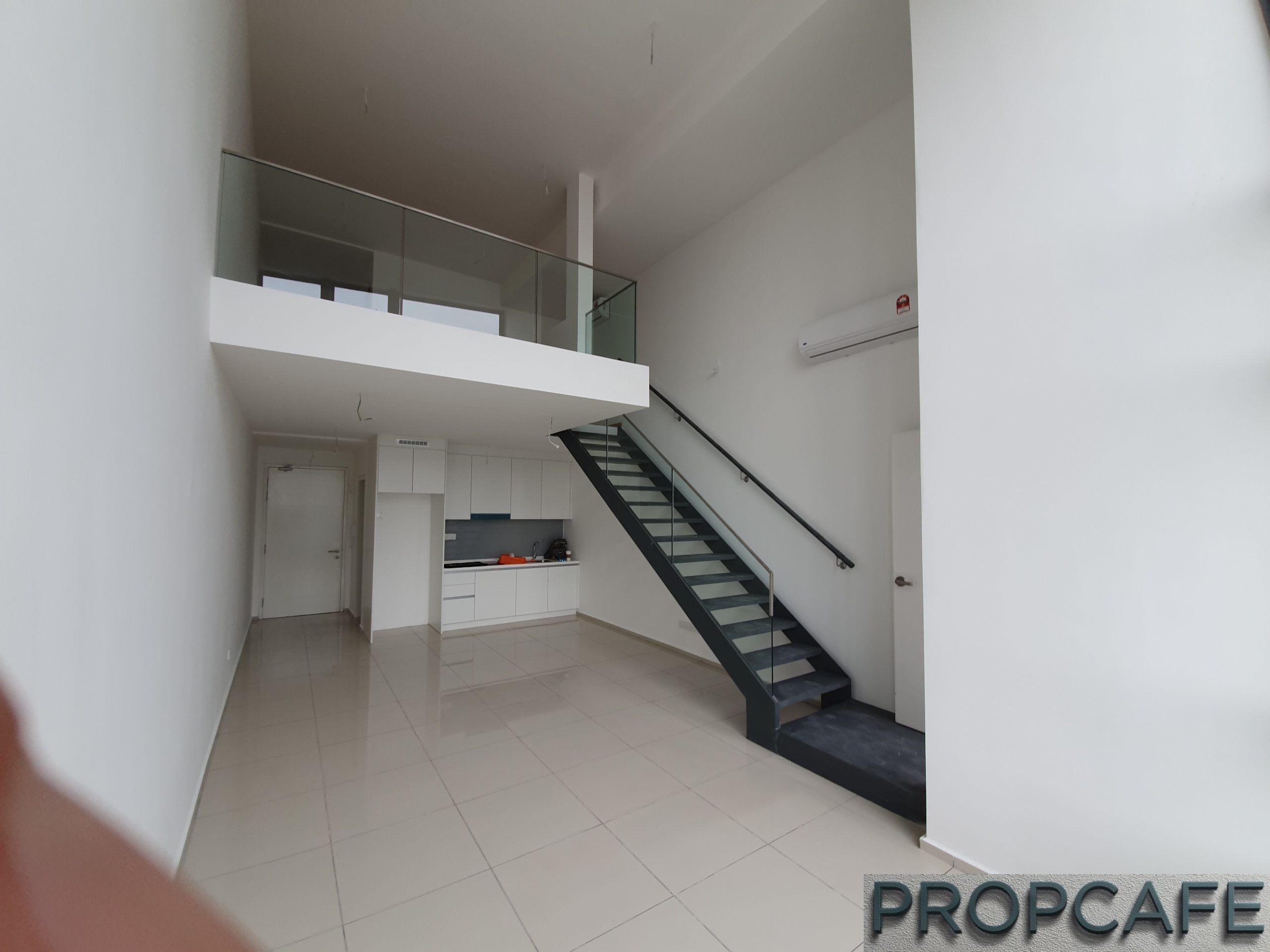
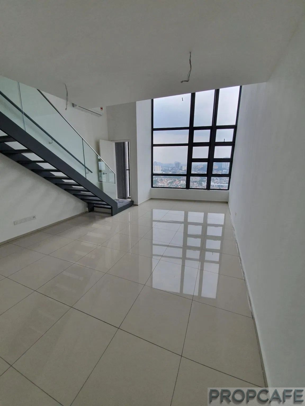
My brief search for an ID firm ended with Aquamason Sdn Bhd.(www.jomeco.com). The out of the box approach to the ID design for this studio apartment in 3 vital areas gave me the confidence to go ahead with their works:-
1. Forget about all the fancy ideas of decorating the DV. The apartment is not spacious enough to carry the effect of chandelier and/or any unique pendant lighting hanging off the ceiling.
Moreover due to its 18’ height ceiling, by safely measure, any works done on the ceiling in the future, be it faulty repair work or just simple bulb replacement will require the renting of scaffolding racking, which by itself is an expensive exercise.
Their suggestion is to remove all light points and fan hook on the ceiling and replaced with easy to reach spot lights installed at the edge of mezzanine floor.
2. To take the design cue of modern raw industrial theme of the building and flows through to the interior of the apartment, they then suggested to render the entire party wall in cement texture pattern organically via professional workmanship, and covered the original porcelain tiles with greyish American Oak timber texture rubber vinyl to bring shade of industrial feel of the entire lower floor, and solved the unevenness of existing original tiles work.
3. In order to capture and utilise the ‘only’ view out to the outside world from the extra height DV picture window, they then suggested to turn this place to an active area by introducing a work bench with dual usage, a breakfast counter to take in all the morning glory (no pun intended) and/or be a dual-usage cosy workstation to that effect.
With the above suggestions, the ground floor will divide into four main active areas, i.e.
(1) upon entrance is the powder cum laundry room, then
(2) kitchen and dining, follows by
(3) living and entertaining zone and ending with
(4) breakfast and work zone. Upstairs, main resting zone with dedicated ‘walk in wardrobe’ space and bathroom.
THE FINAL PRODUCT
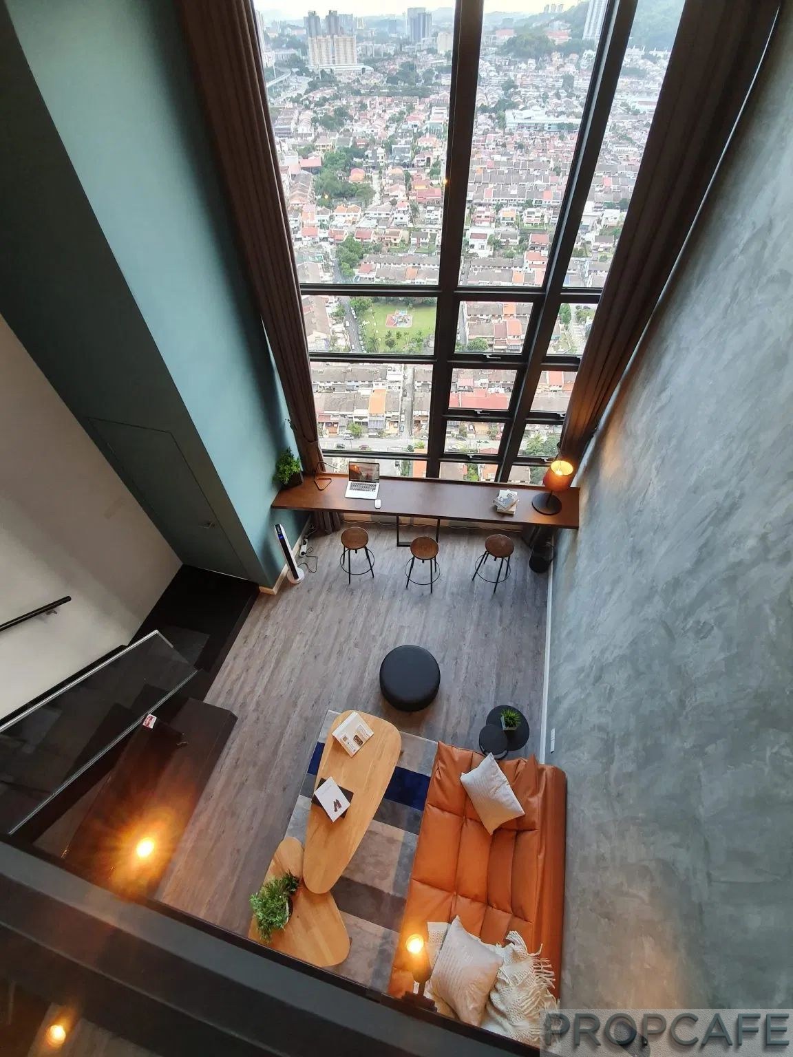
The large party wall upon entry of cement texture rendered paint work compliments well with the rubber vinyl flooring tiles bearing slight clay American oak colour.
By covering the entire ground floor with rubber vinyl flooring tiles, it is not only eliminate the unevenness of original porcelain tiles work, but it also gets rid of the grout lines, softer feel on feet and also hides the hanging cables and wires off the wall.
The highlight of the main column structure of the unit using green teal color paint to mirroring the open blue sky off the picture windows during daytime to give the unit an infinity open feel between indoor and outdoor space.

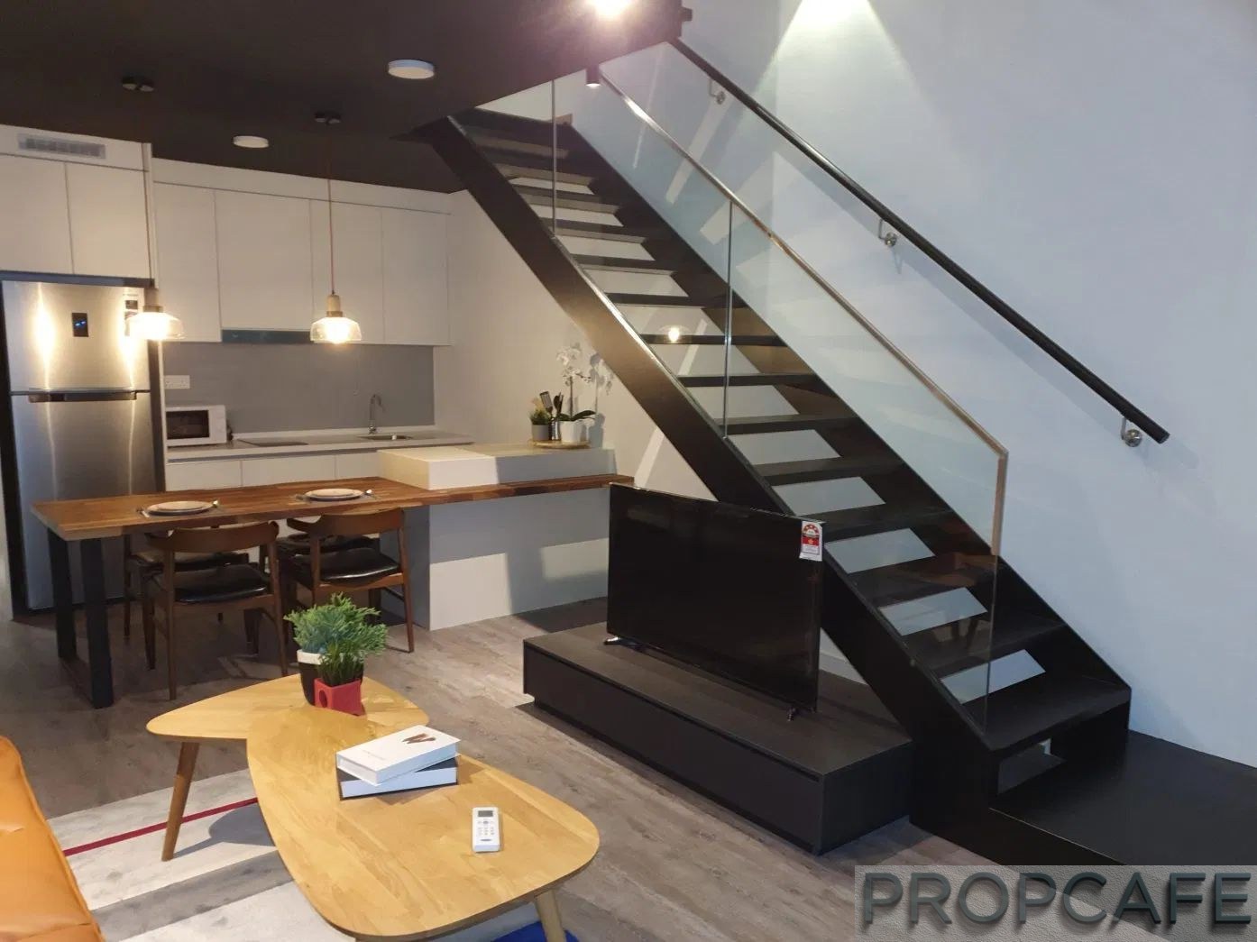
Next, the introduction of a peninsular kitchen counter with built-in dining table for extra storage and work place, and eliminate the need to have free standing dining table and space consumption.
The use of Quartz stone wrapped around cabinet in snow white colour together with custom-made American Black Walnut laminated solid wood dining table with metal leg brings three earth elements [stone, wood and metal] to the soul of the house.

Next is the living area. A custom-built low TV console tucked in between the staircase and living area and the relocation of all the power points off the wall and place underneath the console unit to eliminate the unsighted hanging cable and wiring.
A 3 seater light brown colour sofa bed to cater for occasional overnight guest(s) and it adds aesthetic to the overall apartment.
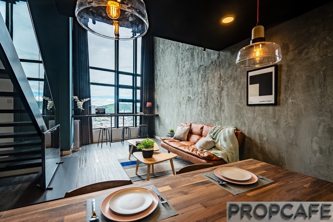
To make full use of the only view out of the outside world within this apartment via the extra-large floor (well, almost) to ceiling picture windows measuring 18’x10’, a motorised curtain is installed with a smoke oak wall to wall solid wood work bench with just a tiny metal leg for ‘floating effect’ in between to encourage the dwellers to sit back and enjoy the expansive view of Cheras and beyond while part doing whatever tasks on hand.
Seriously with view like this, one would hard press to commit to do any serious works whether it’s during the clear blue sky or the glittering night view.

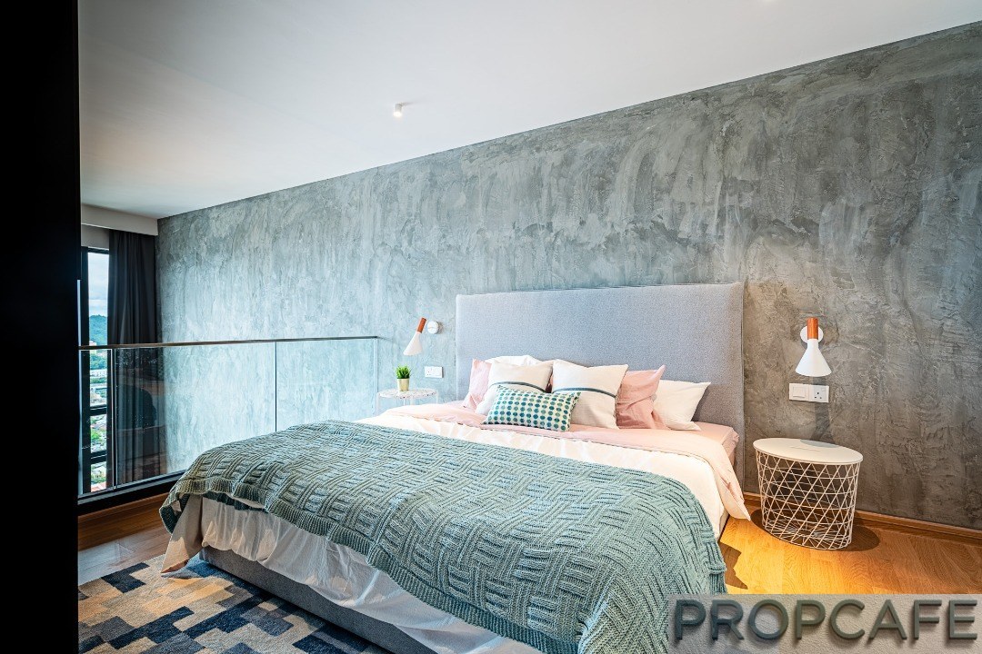
Follow the original floating staircase to the mezzanine floor you will face with a custom-made 6 drawer dresser in solid American Walnut veneer and on your left, a privacy divider with built-in TV console facing the main bed.


A large king size bed with soft fabric bedhead is accompanied by 2 night stands, with one comes with terracotta tiles pattern and other one with solid stone design to compliment the raw cement texture wall.

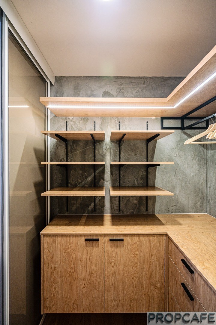
An open concept mini walk in wardrobe with back lighting and imported anti-jump translucent sliding door to further enhance the space and provide further privacy if needed. The bathroom is further enhanced its space with a wall to wall custom-cut mirror.

Overall, The interior design makes use of honest and earthy materials such as wood, metal, stones and cement in harmonious manner to bring out the essence of a lofty expansive duplex apartment.
Note: Some pictures are extracted from ID firm website with permission. You may refer to http://jomeco.design/portfolio/eko-cheras-tower-j/ for further information.
EKOCHERAS 762SQ DUPLEX STUDIO – Industrial Theme with Earthy Approach

How much is the cost of the ID and cost of the duplex ?
Hi Steph, How much do you it worth? 🙂
I see the costly part one would only be the special paint. Aside than the paint the remaining stuff can be DIY, the reason for me is because of high ceiling. 🙂
Yes, one of the costlier parts. But now you have many contractors can do it so we expect the cost is going to trend down. The concern for such work is always the workmanship instead of cost.