Thank you all for sticking by.
ID THEME and IDEAS
Having seen what my house will eventually looked like, now I can gather ID theme and ideas to be implemented in my dream house. Internet is the easier source of references but I am more towards hard evidence therefore I started to buy a lot of magazines and some selected coffee table books. Whenever I saw something that I like, I will scan it down and save it as part of collection. Yes you need to index them well for quick references. I always like my house a clean line look, definitely white color as base and lets the soft furnitures do the color talking.
As for the house itself, I was taking up options provided by developer and also requested few amendments to the interior of the building. Understand that not all developers will do this these days. Amongst the alterations:-
- removed of powder room on ground floor. I intend to use this space for a dry bar.
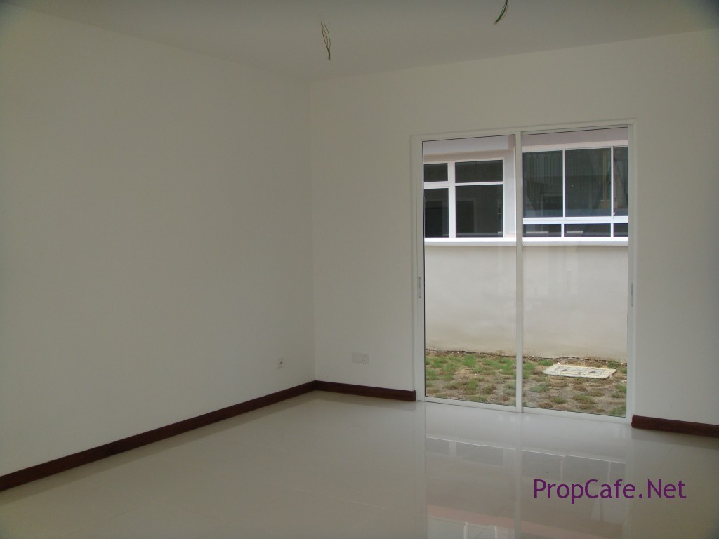
- Guest room on ground floor – not to build the wall. It will turn into TV room with sliding door installed instead of windows.
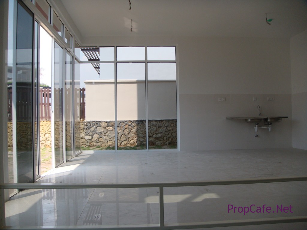
- Wet kitchen – replaced door with glass door, to open up the space.
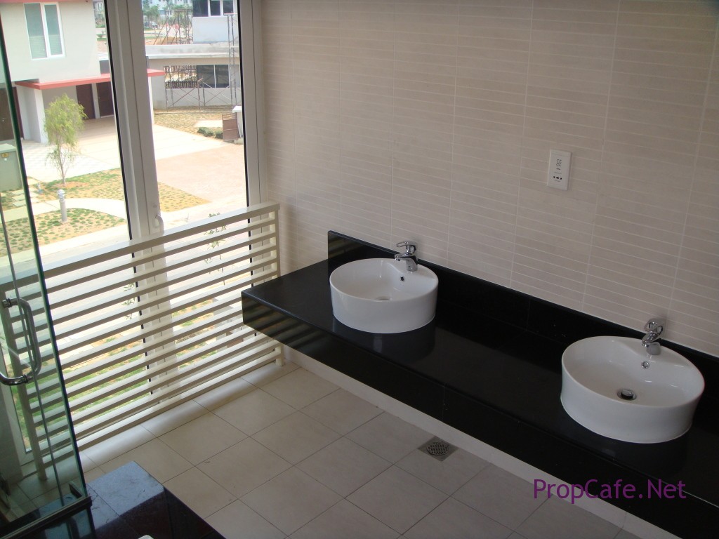
- Request for double vanity sinks instead of single bowl.
I must say that the developer was extremely obliging.
The ID processes were like a never ending story because you have approximately 1.5 years to plan and you never tend to find the best ID because the industry always seen to able to come out with something better everytime. Anywhere here are some of the ideas I have scanned from magazines or pixs that i came across that suited my dream house:-
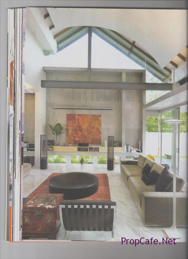
Like the interplay between wooden and white panels.
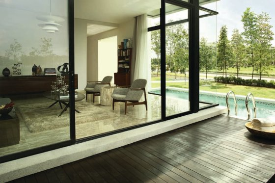
Puchong LakeEdge – liked the wooden timber outdoor area with pool at the side.
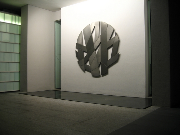
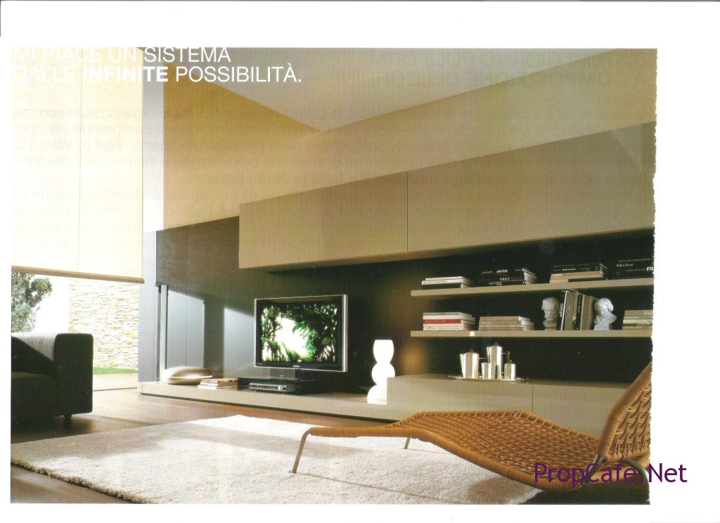
Below: TV display unit by Poliform
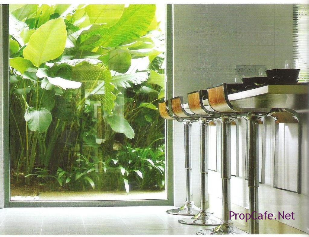
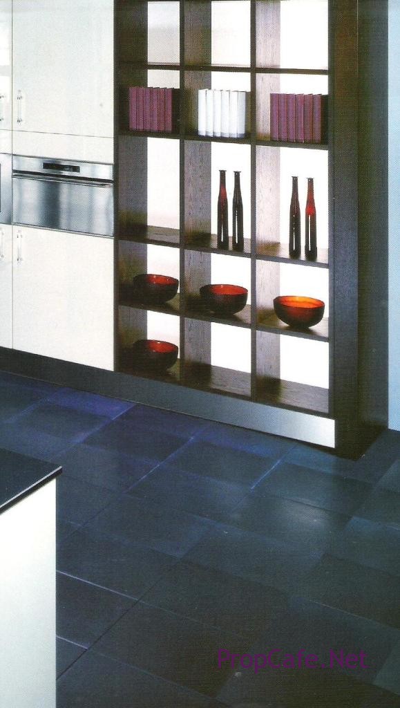
Below: Liked the hollow display cabinet units.
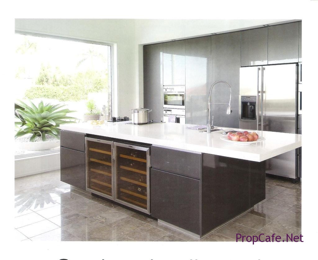
Below: liked the canterlever gallery kitchen
 Vacant Possession of the House
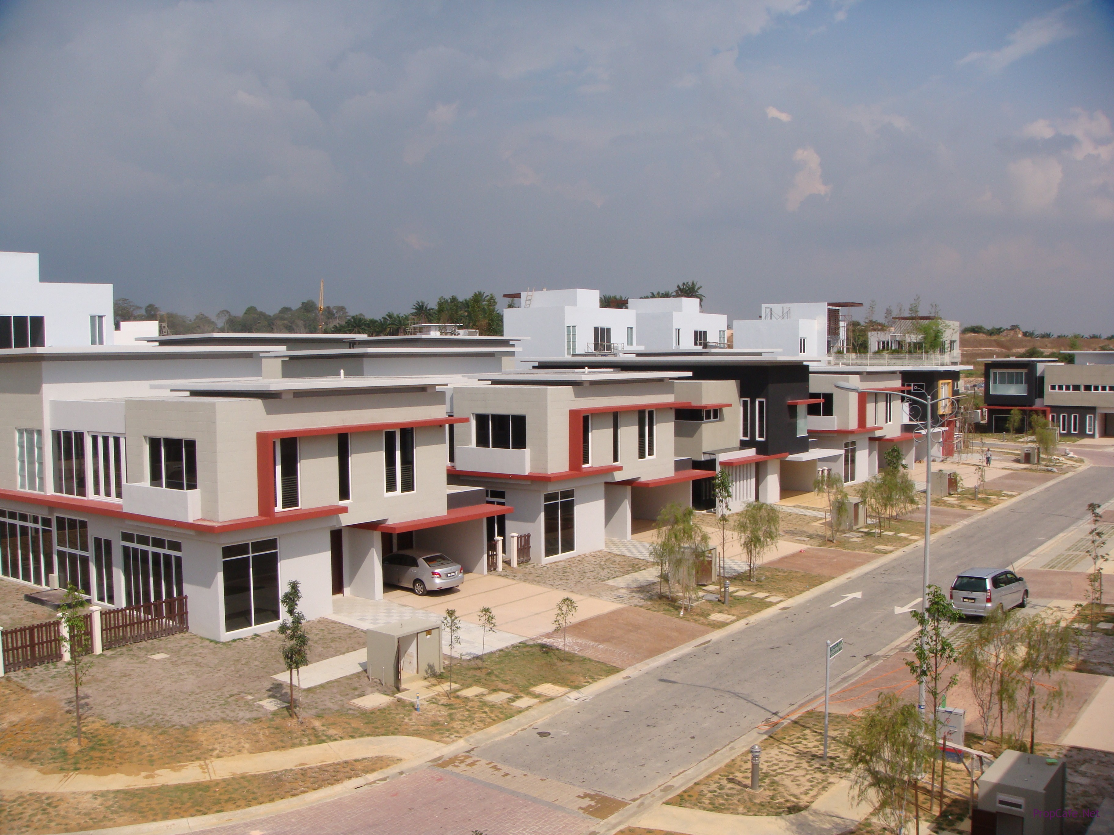
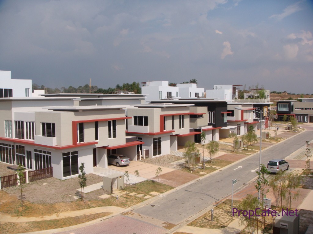
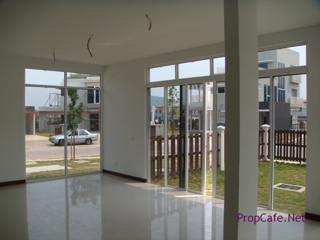
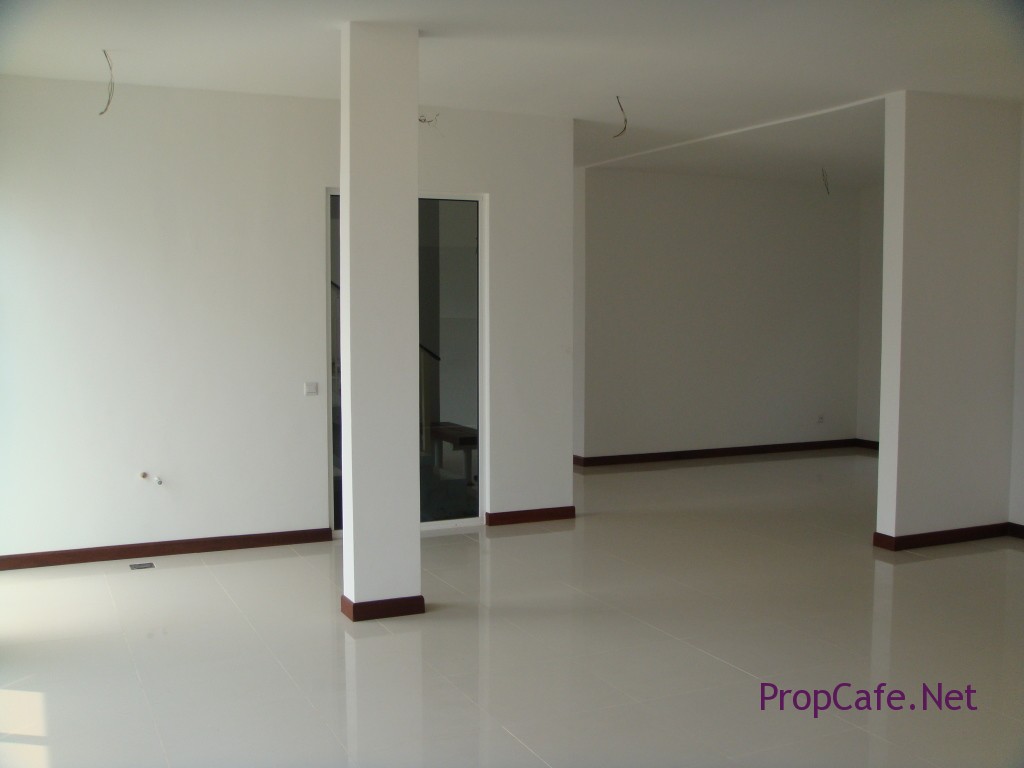
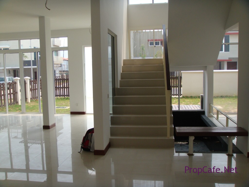
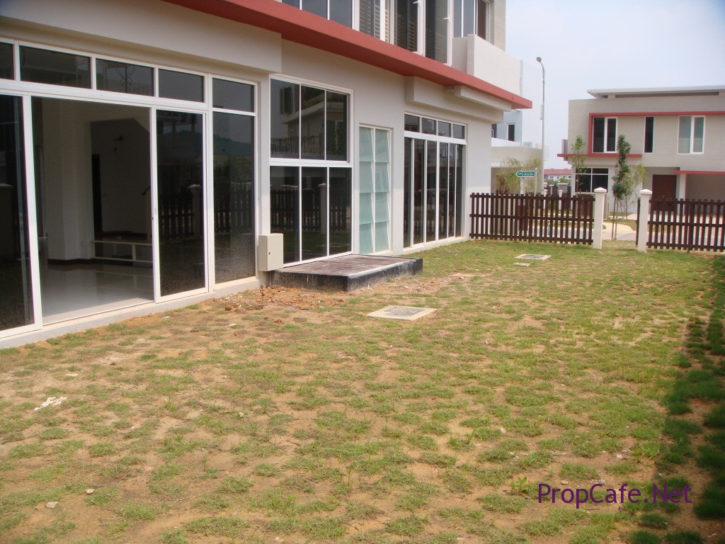
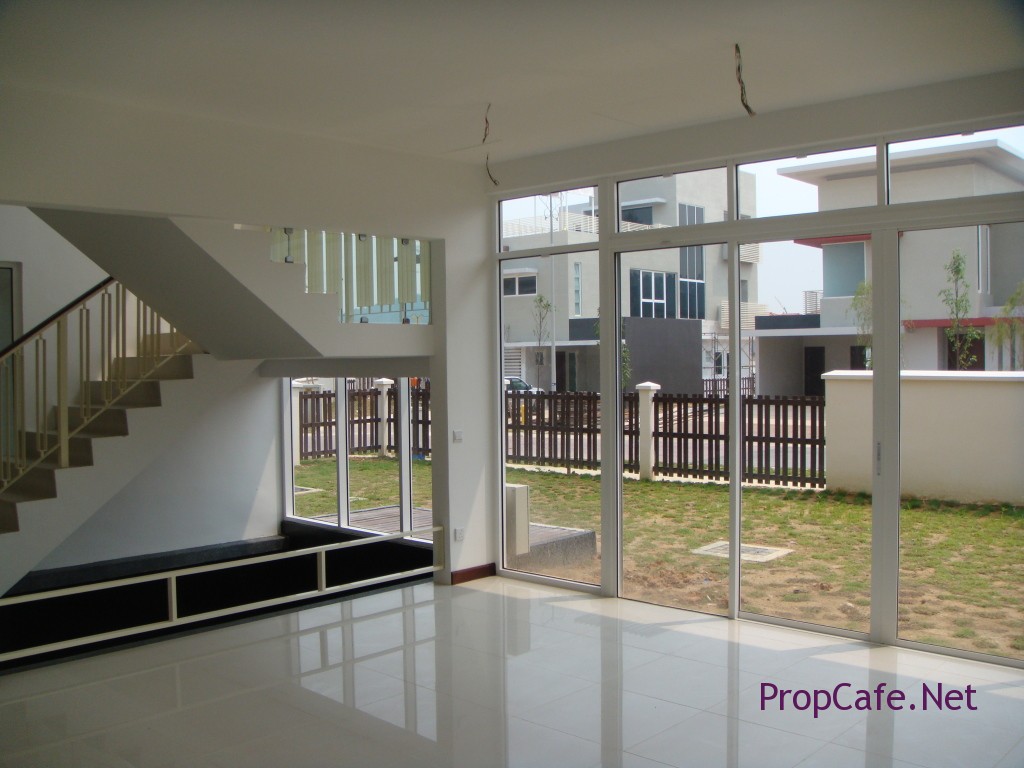
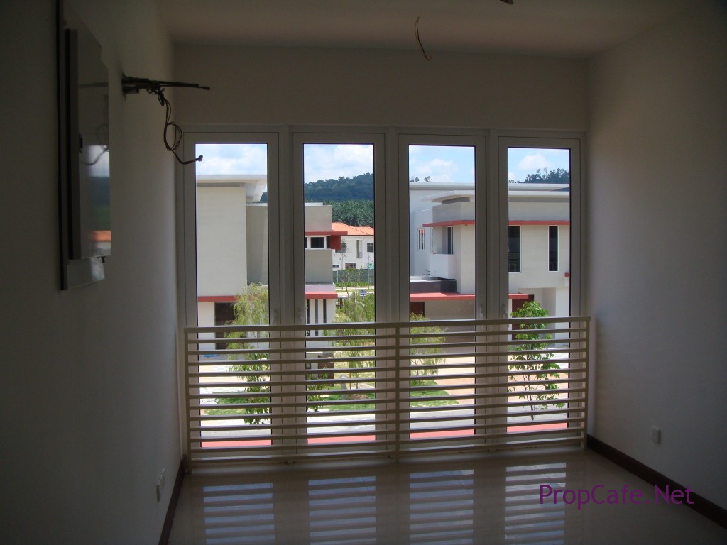
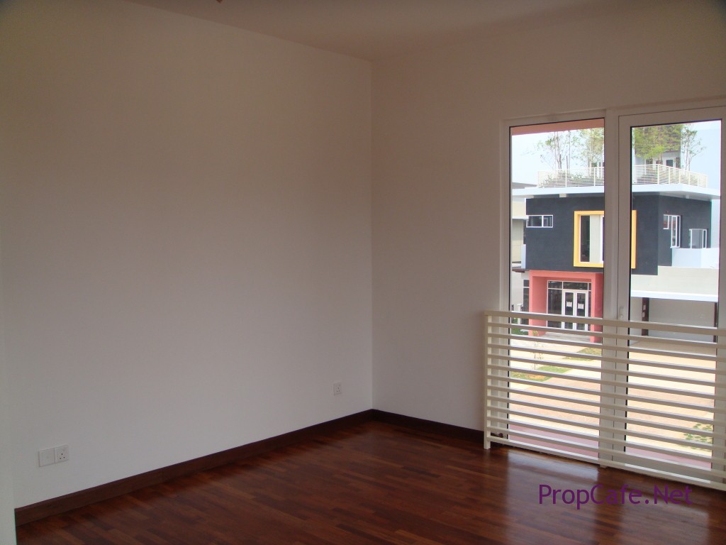
finally the long wait is over. Received VP of the house despite developer had been putting on extra hours to hand over the houses in 2 years to us. As expected, pretty bare unit but to our surprise, the common area looks spacious and the house arrangement in circus instead of straight row does give us the feeling of less mass production. And it does help when there are 7 different models in 32 units.
Bird eye view…
Living Lounge
Living towards dry bar (proposed) and TV lounge (afar)
Staircases with internal pond
Garden strip
Dining area
Dining and dry kitchen
1st floor family lounge
Ground floor Guest bedroom now turns into TV lounge
Masterbedroom
MasterBathroom
What was next? While pending for defect rectification, I guess next will be appointment of an interior designer. Someone that shares my vision and budget I guess. See you in Part III.
Next Episode
Episode 3 : The Finishing Moment
PROPCAFE™ Guide : RENOVATION a TO z, MY REAL LIFE EXPERIENCE (EPISODE III)
