Windows On The Park
Windows On The Park Cheras has recently VPed. We wrote a very extensive on Windows On The Park Cheras 3 years ago here.
How time flies and recently we had the opportunity to visit the actual unit at Windows On The Park Cheras and we thought we should share this with you.
These days there are many developers market projects as high end product and more often we tend to see significant variance between initial artist impression when it comes to VP, that is ‘the beauty’ of sell then build, and purchasers really have to weight pros and cons before signing the dotted line.
One of the developers that we greatly admire is Selangor Dredging Berhad (“SDB”). SDB is among a few developers in our book that able to deliver its product concepts fully. Some fine example are 5 Stones and Ameera, SS2.
Windows On The Park Cheras is no exception. Our first impression on Windows On The Park Cheras that is has the look and feel of 5 Stones, SS2. The moment you step into Windows On The Park Cheras you feel ‘atas’.
We seriously like what we saw at Windows On The Park Cheras. Other than the location which is pretty subjective. We just could not help but to fall in love.
Our quick summary at Windows On The Park
Pros:
- This condo got class.
- Good layout that maximizes natural light into the condo units.
- The living room, the sliding door and generous balcony are those things can make one envy by just seeing it.
- Plenty of greens that fit the theme well, the condo is literally a park, just like Windows On The Park Cheras.
- Good finishing
Cons:
- Acccess and lokasi BTHO, Batu 9, Cheras Selatan, not so sexy.
- Some units sizes are over the top
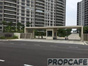 The entrance statement of Windows On The Park Cheras is just kinda subtle.

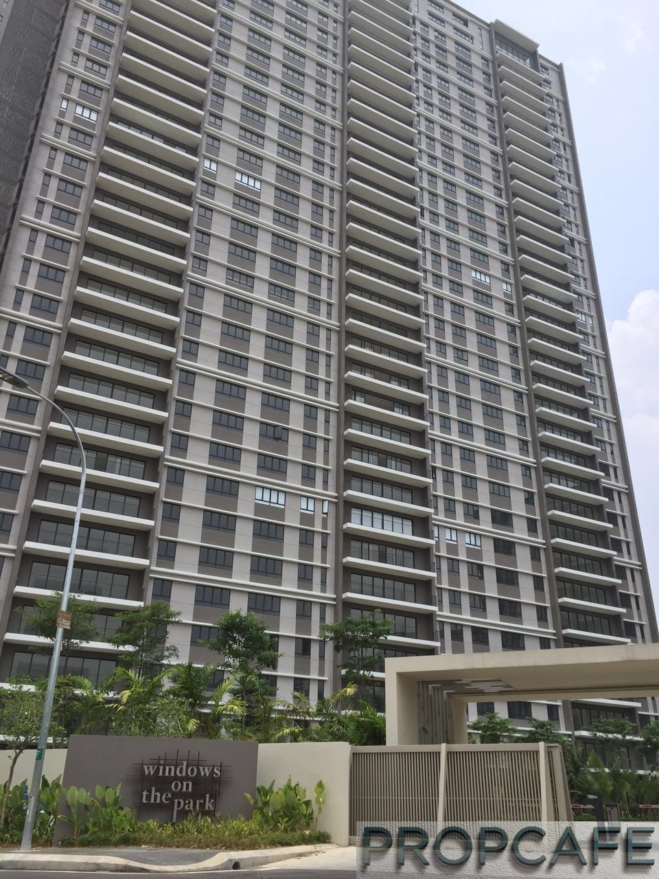
The facade of Windows On The Park Cheras.
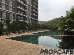
The swimming pool at Windows On The Park Cheras.
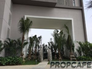 The theme of the Windows On the Park Cheras ‘the windows’.
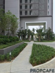
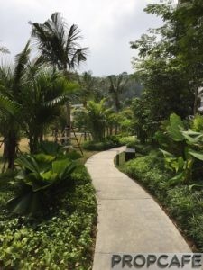
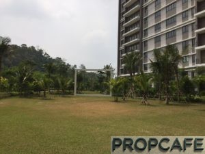
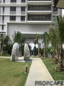
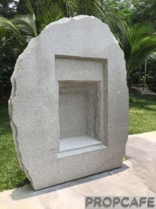
What do you think of the patio unit, feels as in living on a ground floor. It gets full view of the park, but a ground floor unit in a highrise, should one consider landed? 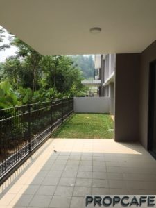
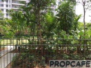
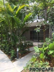
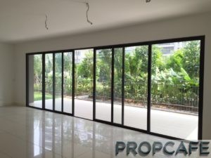
Look at the length of the sliding door, it enjoys the maximum expansive view.
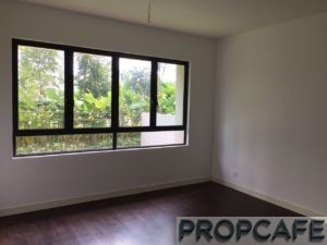
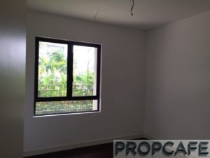
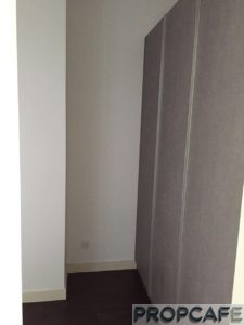
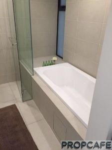
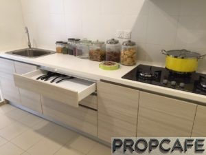
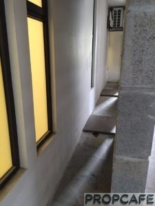
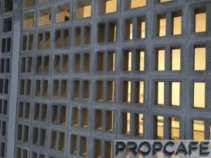
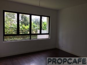
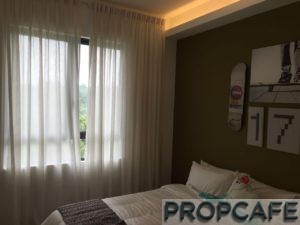
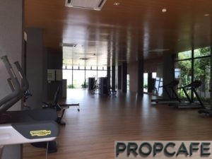
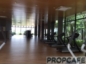
A peek into Windows On the Park Cheras Facilities.
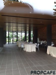
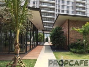
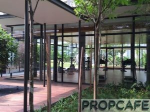
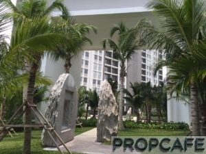
Everything about tis condo project is nice nice nice….except
The location….
Good choice if you are currently live around the area. Absolutely love the vast expansive sliding door from living to dining.
The ground floor unit also very nice w some turf to do gardening. Best of both world.
Well done PCN for the coverage.
Cons: the building facade just looks like flat.
Yea agreed, actually kind of disappointed with the facade, just painted dark grey n lighter grey on the facade looks like low cost building. And Guardhouse simple is good, but looks old and yellowish?
anyhow, their balcony & pool are pretty good there.
http://pictures.my.ippstatic.com/realtors/images/640/15208/a4f91b98c06d4ad584a2d0f552eec4b9.jpg
Low cost apartment in penang, looks similar? the different will be the long balcony missing out there lol
The facade is subjective. I myself kinda like it, minimalist and industrial look, can withstand time and doesn’t look busy with different colors. Besides, there will be little maintenance to keep the condo look fresh for the years ahead (i.e. painting) since the color is dull and monotone.
I like the recent spate of minimalist/industrial design that have been cropping up in KV over the past few years, like the recently launched Sunway Condo in Mt Kiara and the soon to be completed the Establishment in Bangsar/Brickfields.
Well done on the coverage on WoTP!
I know Minimalist =)
Their 5stones is minimalist as well. Simple dark grey but so classy , so much classy than this wotp. Inside is beautiful but not the outside. Yes its subject and beauty is in the eyes of beholder. =)
Yea i know Minimalist, most of the condo only have duo tones not like what you said many colors. Simple is good. Just like their 5stones, very classy. Simple yet sophisticated but not this flat-like facade. I show to all my friends, most of them saying the same.
Everything beautiful inside of WOTP but not the facade n guardhouse. But its individual preference and beauty is in the eyes of beholder. =)